It is generally not advised to use default Windows fonts.
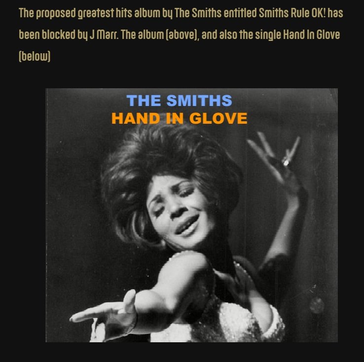
Arial is not Helvetica.
The colours of blue and orange may certainly “pop” against each other, but they don’t look right here, especially when compared to past Smiths sleeves. Also the whole blue/orange thing is insanely overdone, just avoid it.
While the artist name and title are centered to themselves, the full block of text itself is not. It is leaning noticably to the left, and people can think up their own HIGNFY-style punchline for that one.
The overall effect is rather like a CD sleeve anyone might have made when CD-Rs were a thing. Remember Nero Cover Designer? I used the picture of the kitten and the ducks more than once.
While this is straying slightly from the matter at hand, the proposed title for the accompanying album is shit and is oddly reminscent of a Children’s Film Foundation production from 1973.